| |
This website was created for Staffordshire University's overseas office with the view to giving overseas students an impression of what the university was like before they came to the UK. The project had already been tackled by one group of designers but they didn't come up with a solution that was to the university's liking. The university's overseas office requested that the website cover the two main campuses in Stafford and Stoke, it be completed in the next two months from when the project was set and that it show floor plans as well as giving graphical and textual information about the different facilities and utilities at the university. The project was going to be handled by a group of people with a wide range of skills in graphics, multimedia and web design. We talked round different solutions that were on the table and their relative required budget and complexity.
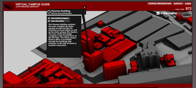
In the end we settled on creating a 3D map of the university, where users could click on different buildings and access the relevent floor plans of maps via use of menus. We did discuss allowing users to chose from the 3D map different camera viewpoint so they could see photographic images of
particular areas near where they had clicked, but this was deemed to be too labour intensive, expensive in terms of the time it would take to create and didn't especially meet the universities requirement.
The previous team who tackled the project had chosen to represent the university campuses through photographs taken from google maps and multi-map websites, using pin icons to represent the locations of amenities at the university. This solution made it difficult to see which of the building in the photograph belonged to the university and which did not. This was especially true a Stoke campus where the university building intermingle with the train station and residential buildings. Instead we chose to create a 3D vector map of the university campuses and highlight university buidlings in red and other building in grey. By doing this we reduced the information to only that which was needed, allowing the user to more easily comprehend the map.
The maps were presented in perspective projection rather than isometric as this was a more natural way of viewing objects. This did cause some problems however. At the edges of the map the upright of the buildings begin to lean outwards at a pronounced angle. At the time the maps were being drawn this was thought to be a problem but when the project was completed the effect was hardly noticable. The layout of the building was gathered from maps already available at the universities help desks. We tried to copy these as closley as possible but we found that they had a tendency to be more diagramatic that show actual distances, angles and roads, so we used a mixture of site visits, ordinance survey and given maps to synthesise that 3D map layout.
The university buildings were first created as 3D models on the computer and then once the most efficient perspective and direction were chosen, they were converted to vector images to help give a clean, infographic look to the map. The outlines of the building were given the same colour and fill colour of the buidlings. The red university buildings have red outlines where as the grey building had dark grey outlines. This gives a softer look the map than using black outlines. Once the map had been finished an ambient occlusion pass was rendered from the original 3D model of the university. An ambient occlusion pass is a method simulating the inherent shadows that exist in enclosed areas around the map. For example if you look at the base of buildings or where buildings are close together; the closeness of the geometry always shades these areas from diffuse light coming from the sky, more than open areas like the roads or car parks. Adding this level of lighting to the map turned it from a flat image into an image where the 3D spaces of the environment were more readily percieved.
The university asked that there be a way for them to easily change the text that presents itself when a user clicks on a building. We talked it round with the university and decided that that the best way to all them control was to have the text in the information tags be read from a text file; which was easier for them to change and upload that having to work with flash. It would have been too time and labour consuming to create a map and interface that allowed the clients to customise the map to the degree they wanted without using Adobe Flash to edit the originating files. In general terms creating something that is fixed is always easier than creating the same thing so that it is dynamic and can be changed by the user or client as they wish.
When the Stafford campus map was complete we previewed it to the university in a rendition of the finished state. They were very pleased and we continued to finish the project.
TIME TO COMPLETE: 3 WEEKS
|
|